

Drought and wildfire risk intensified across many parts of the world in 2026. In the EU and UK, half the territory was under some level of drought by late July. In the EU alone, wildfires burned roughly twice the 20-year average for the date. In the US, 8.5 million acres burned by late September, the highest figure in a decade according to independent reporting.
Satellite imagery records both halves of that sequence: the vegetation stress and shrinking water extent that build through a dry summer, and the burn scars and recovery that follow a fire. This piece looks at what that record shows in two places where the 2026 season was measurable from orbit, the Rhine in Germany and southern Utah in the western US.
How severe was the 2026 drought in Europe?
By late July 2026, 50% of European Union and UK territory was experiencing drought at some level of intensity, with 9% at alert level. The European Drought Observatory classifies these conditions in three stages: watch (rainfall falls below usual levels), warning (soil moisture drops), and alert (both persist, and vegetation shows visible stress).
The 50% figure is below Europe’s two reference drought years, 54% in 2018 and 60% in 2022, though the hydrological response in 2026 was more severe than either. Four major rivers, the Rhine, Loire, Po and Danube, fell to record or near-record levels, and the Rhine measured 74cm at Cologne in July. The European Commission’s Joint Research Centre also cut its crop forecasts, with winter crops down 1 to 4% and grain maize and sunflower down 6 to 7%.
Wildfire followed the same pattern. The Joint Research Centre’s current wildfire situation report, sourced from the European Forest Fire Information System (EFFIS), recorded 669,118 hectares burned across 2,047 fires by 16 September 2026, short of the record 1,009,828 hectares by the same date in 2025 but still nearly double the 20-year average of 346,567 hectares.
The Rhine: what a shrinking river looks like from orbit
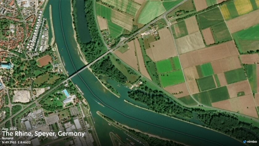
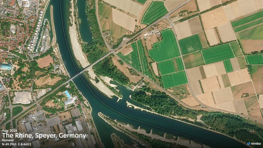
Rhine at Speyer, Germany: August 2025 vs August 2026, with sandbanks newly exposed by drought.
Looking at Speyer and comparing the same month a year apart (August 2025 to August 2026) shows the difference directly. Sandbanks appear in the 2026 image that simply were not there before. Since both images are from the same month, this reflects a severe water retreat rather than the normal seasonal cycle.
WSV Pegelonline’s Speyer gauge confirms it. By 4 August 2026, Speyer stood just 16cm above its 2018 record low, according to Schifffahrt und Technik. Downstream at Kaub, the river fell further. On 12 August 2026, the gauge there dropped to 14cm, its lowest level since records began in 1880, below the previous record of 25cm set in October 2018, according to Insurance Journal.
A gauge gives a number at one point. Satellite imagery shows the whole river: where it narrows, where the bed is exposed, how far the change reaches. At Nimbo’s 2.5m AI-enhanced resolution, the shoreline stays sharp, so the retreat reads clearly. Seeing change at this scale, with fresh imagery every month, lets teams track it and plan around it.
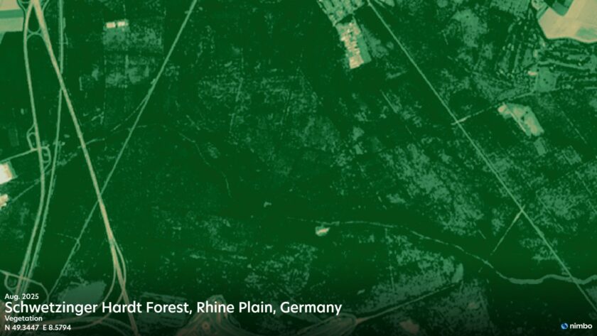
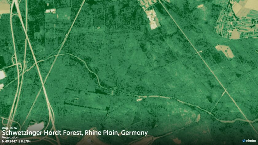
Schwetzinger Hardt forest, Rhine plain, Germany: NDVI, August 2025 vs August 2026, showing vegetation stress during the drought.
Water extent is the visible half of drought. Vegetation stress is the half that requires a calculation. Schwetzinger Hardt, a forest on the Rhine plain near Speyer, gets the same comparison as the river: the same month, a year apart, which keeps normal seasonal change out of the picture as far as possible.
The normalised difference vegetation index, NDVI, is what turns that comparison into a number: as vegetation dries out and canopy density falls, the index value drops. NDVI on its own indicates that vegetation is under stress rather than identifying the cause, and detailed biomass or yield work generally combines it with field sampling or radar data.
How does the US season compare?
The National Interagency Fire Center recorded 56,448 fires and 8,540,640 acres burned in the US year to date as of 20 September 2026, with 46 large fires still under active suppression and 2,001,930 acres burned on those large fires alone. Newsweek has described the total as the highest US wildfire acreage in a decade.
One of the most destructive fires of the US season started on 22 June 2026 near Beaver, Utah. The Cottonwood Fire burned 97,464 acres across Beaver and Piute counties, destroyed at least 150 structures including the Eagle Point Resort, and Utah Governor Spencer Cox said there was a very good chance it was already the most destructive fire in the state’s history.
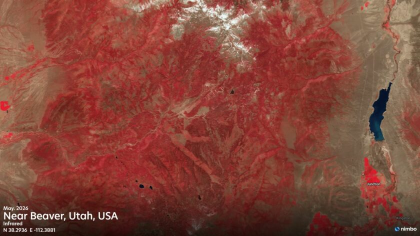
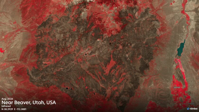
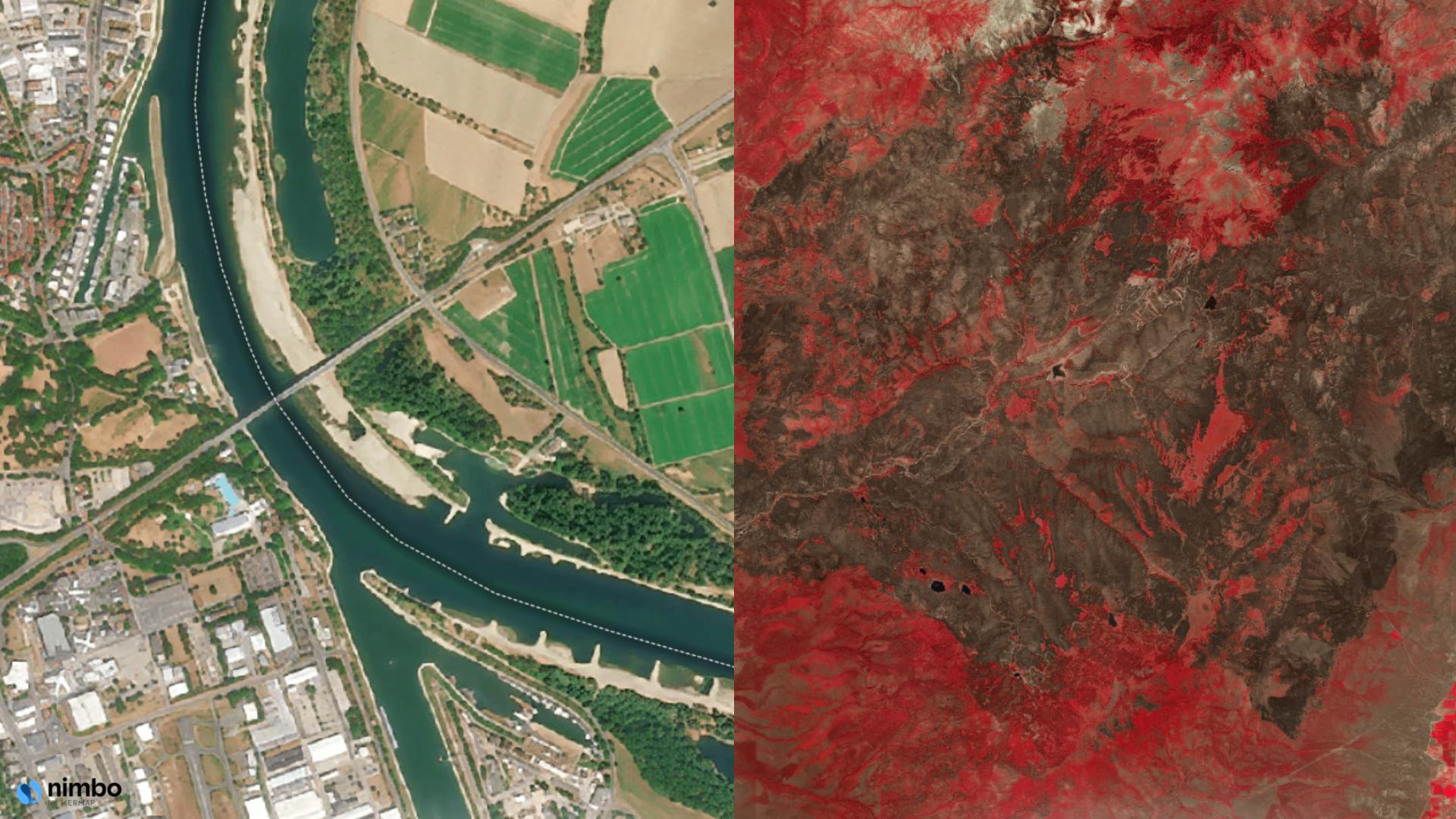
Near Beaver, Utah, USA: May 2026, before the Cottonwood Fire, and August 2026, after it burned through.
In this near-infrared composite, healthy vegetation renders red and burned ground renders dark. The August image shows a large dark patch cut into the surrounding red hillside, stretching from the mountains above Beaver towards Junction and Kingston to the east, consistent with the 97,464 acres officially reported burned.
How does satellite imagery record burn severity?
Burn severity mapping works on the same principle as vegetation monitoring, using a different band pair. The normalised burn ratio, NBR, compares near-infrared and shortwave infrared reflectance. Living vegetation reflects near-infrared strongly; ash, char and exposed soil do not, and their shortwave infrared response rises. Subtracting a post-fire NBR from a pre-fire NBR gives dNBR, the standard measure for grading how severely each part of a burn was affected.
However, the foundational step of any reliable satellite imagery wildfire damage assessment is accurately defining the burn perimeter. A near-infrared composite gives a quicker visual read of the burned area, without the calculation. Vegetated ground renders red, the burn scar renders dark, and the edge of the burned area reads clearly at a glance. That is usually enough to document extent. Severity grading is what dNBR adds.
Monitoring continues after the fire is contained. A consistent post-fire monitoring satellite record tracks how the landscape changes month by month: how quickly vegetation returns, which parts of the scar recover and which do not, and how long the landscape stays exposed. For ESG reporting, insurance assessment and post-fire land management, that continuing record is often more useful than the single image taken the week the fire went out.
What Nimbo provides for this kind of monitoring
Nimbo’s 2.5m basemap layer, AI-enhanced from Copernicus Sentinel data, updates monthly and is largely cloud-free worldwide. That detail makes change easier to read on screen: it’s the same resolution behind the Speyer sandbanks and any channel edge that needs to read clearly.
It also provides NDVI and NIR imagery, run against Nimbo’s monthly archive, which turn “the vegetation looks stressed” or “the fire got there” into a comparable number, month to month and year to year, rather than a one-off read.
All of the above are available in the browser or through API, WMTS and TMS for integration into existing GIS workflows.
Putting the Record to Use
Both seasons are now part of the observational record. What that record is worth depends on whether it was captured at the resolution and frequency the work requires, and on whether the same area can be compared month to month and year to year without gaps.
Nimbo’s cloud-free satellite basemaps cover both regions at monthly cadence. Contact our team to discuss coverage for your specific sites.
FAQ
How much of Europe was in drought in 2026?
By late July 2026, 50% of EU and UK territory was experiencing drought, with 9% at the highest alert level. That’s below the recent benchmark years of 2018 (54%) and 2022 (60%).
How low did the Rhine fall in 2026?
The Kaub gauge on the Middle Rhine fell to 14cm on 12 August 2026, its lowest level since records began in 1880, passing the previous record of 25cm set in October 2018. Upstream at Speyer, satellite imagery captured the same retreat, with newly exposed sandbanks visible compared with August a year earlier.
How many acres burned in the US in 2026?
As of late September 2026, over 8.5 million acres had burned across more than 56,000 fires, marking the highest US wildfire acreage in a decade.
How does satellite imagery detect drought before a fire starts?
Two signals appear before a fire season peaks: water extent, which is directly visible in true-colour imagery as rivers and reservoirs retreat, and vegetation stress, which shows up as a fall in NDVI compared with the same month in previous years.
What is burn severity mapping?
Burn severity mapping grades how severely each part of a burned area was affected, typically by comparing the normalised burn ratio (NBR) before and after a fire. A near-infrared composite gives a quicker visual read of the burned area, without the calculation.
Can I use Nimbo in QGIS or ArcGIS?
Yes. Nimbo offers documented GIS connections through map services such as WMTS, WMS and TMS. Available layers depend on your account. These services stream rendered imagery; they are not a download of source spectral rasters for local pixel-level processing.
Can Nimbo monthly mosaics track an active wildfire in real time?
No. A monthly mosaic is intended for recurring or retrospective comparison, not live incident response. For event-specific interpretation, check the mosaic period and the freshness of the observations used.
Does Nimbo HD provide 2.5m NDVI or burn-severity data?
No. Nimbo HD is AI-enhanced 2.5m RGB imagery. The standard NIR and NDVI layers are provided at 10m. HD improves visual interpretation but does not, by itself, establish 2.5m measurement accuracy.
Drought statistics: European Commission Joint Research Centre.
Wildfire statistics: JRC current wildfire situation report, sourced from EFFIS.
US wildfire statistics: National Interagency Fire Center.
Rhine gauge data: WSV Pegelonline; Kaub record comparison: Insurance Journal.