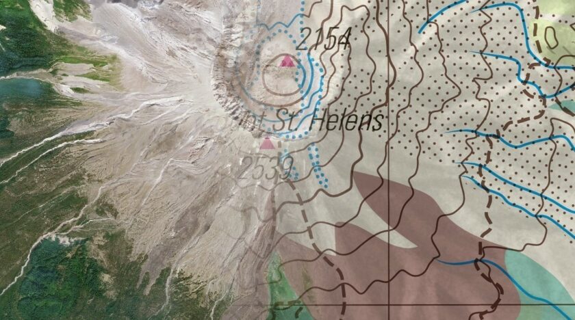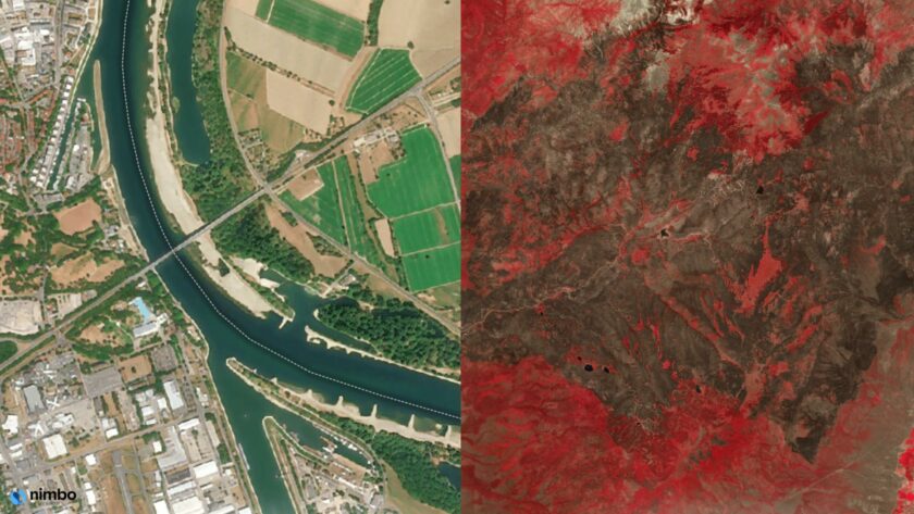


A satellite image can appear online minutes after an event and still have been acquired weeks or months earlier.
This matters far beyond specialist OSINT teams. Google Maps has become the default place where people look when they want to understand a location. The same reflex exists inside companies: when someone wants to inspect a site, assess a territory or see whether something has changed, the satellite layer is often the first tool they open.
The problem begins when a navigation basemap is used to answer an Earth Observation question. The user is no longer asking only, “Where is this place?” They are asking, “How recent is this image?”, “What did the site look like last month?” or “When did this change occur?” Those questions require dated and comparable imagery, not simply the basemap currently selected by a platform.
The problem is that publication time, discovery time and acquisition time are three different things.
The Google Maps reflex and the information gap
Google Maps is highly effective as a general visual reference for locating and understanding places. But it is built to give a single, clear view of a place for navigation, not to provide the homogeneous, dated record needed to compare that place over time.
This distinction explains why many potential Nimbo users only recognise their need when their familiar basemap stops answering an operational question. They are not necessarily looking for “another map”. They need to know which period an image represents, compare the same location month after month, monitor a large territory consistently or integrate the imagery into a GIS or client application.
Nimbo addresses that information gap. It processes Sentinel-2 observations into global, largely cloud-free and radiometrically consistent monthly mosaics. Analysts and operational teams can inspect the same place across a regular timeline before deciding which original scenes, higher-resolution imagery or external sources require deeper investigation. Learn more about Nimbo Basemaps
Nimbo is not meant to replace Google Maps for navigation. Its role is more precise: to establish a dated visual baseline, narrow the relevant period and expose interpretations that do not fit the historical imagery.
The Tehran oil depot: a case of ambiguous timing
On 8 March 2026, a Reddit user viewed the Shahran oil depot in Tehran on Google Maps and saw several storage tanks that appeared heavily damaged. Because a strike on the depot had been reported the previous evening, the user reasonably wondered whether Google had already published near-real-time satellite confirmation of the attack.
The user was following a common and understandable workflow: open the best-known satellite map, locate the reported event and interpret the image currently displayed. This is also how many organisations begin monitoring sites, projects or territories before discovering that the image date and historical sequence matter as much as the image itself.
View the post reporting the March 2026 attack
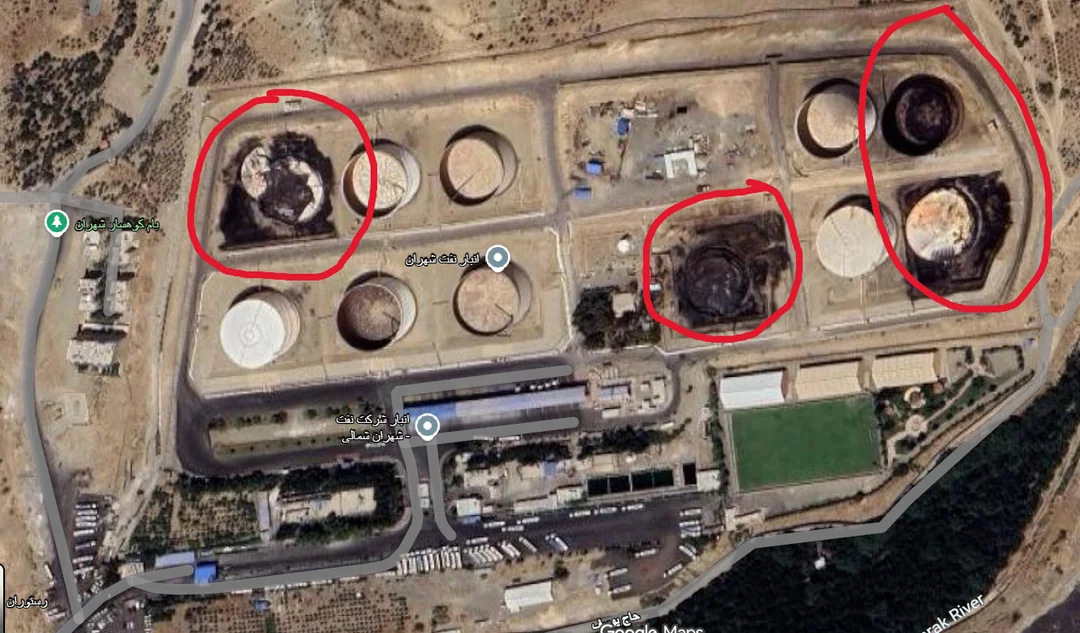
The damaged appearance of the depot was real. The assumption about its timing was not established.
A map interface can show the imagery currently selected by the provider without making its acquisition date obvious. An image discovered after an event cannot therefore be treated as proof that it depicts that event. The claim has to be tested against dated imagery from before and after each reported change.
The first visible change: May to June 2025
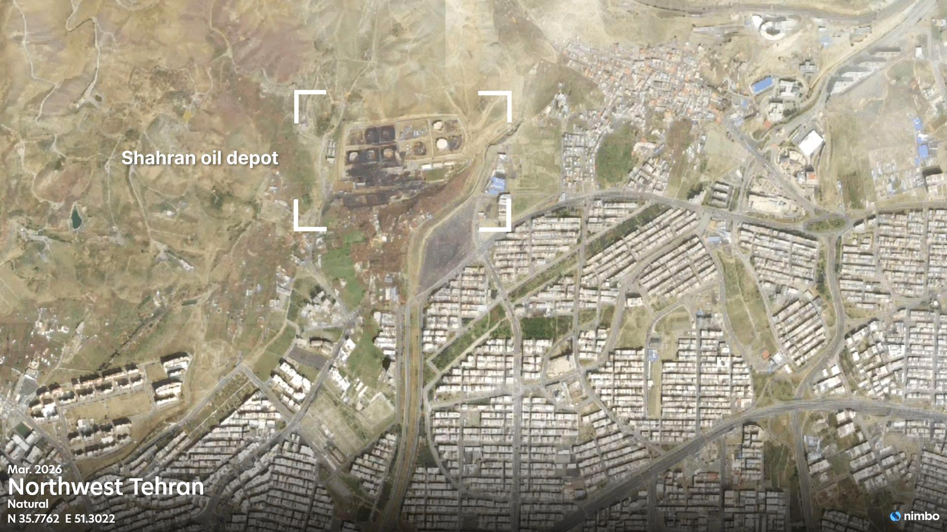
We located the Shahran oil depot in Nimbo Earth Online and compared the May and June 2025 monthly mosaics using the same framing. May provides the earlier baseline. In the June mosaic, several storage tanks and their immediate surroundings show marked visible change: darkened surfaces, altered tank outlines and dark staining on the surrounding ground. Open the Shahran comparison in Nimbo: May 2025 versus June 2025
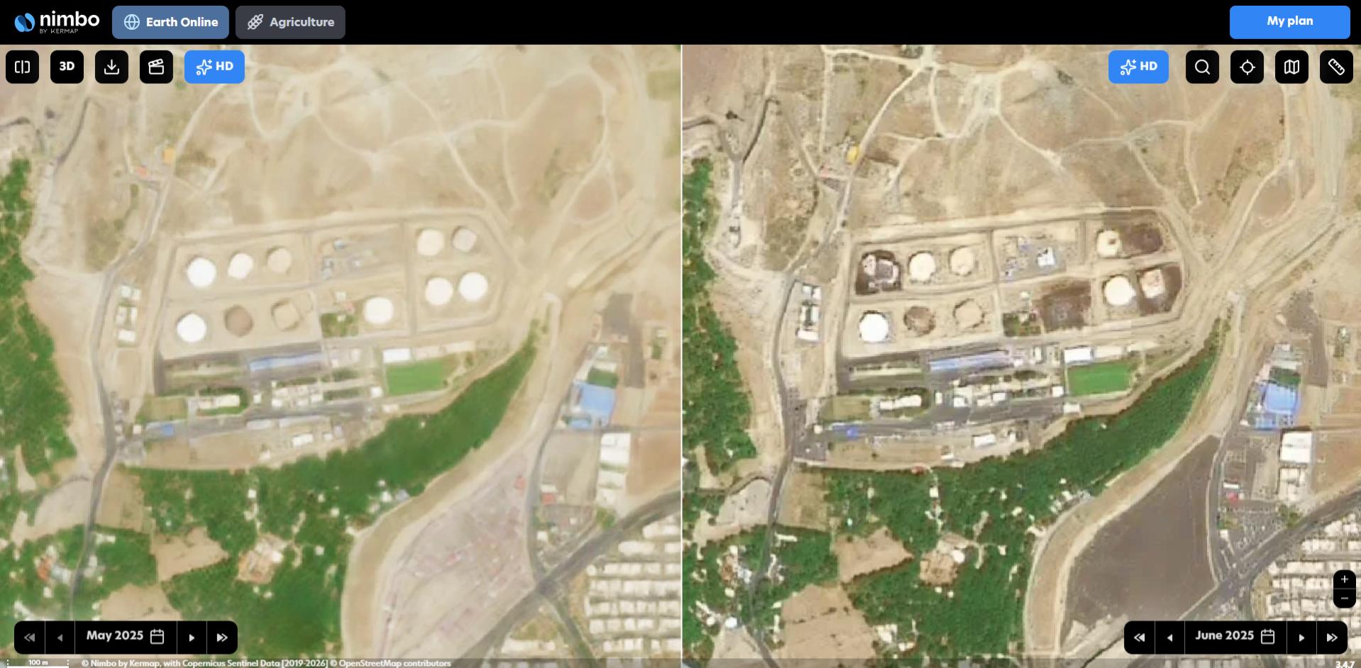
This comparison is more informative than the later Google Maps image because it establishes when the first major alteration entered the visible record. The change appears between two dated monthly mosaics, rather than being inferred from the moment at which a basemap image was discovered.
The timing is consistent with claims that the depot was attacked during the Twelve-Day War in June 2025. Nimbo does not identify the weapon, responsible actor or exact day from the mosaic alone. It does, however, show that the alteration later seen on Google Maps was not created by the March 2026 event.
A second visible change: February to March 2026
The historical sequence also shows that the Reddit user was not looking at a site that had remained unchanged since June 2025. Comparing the February and March 2026 mosaics reveals further visible change across the depot: the area of visible alteration expands, with additional darkened zones and further changes around the adjacent infrastructure. Open the Shahran comparison in Nimbo: February 2026 versus March 2026
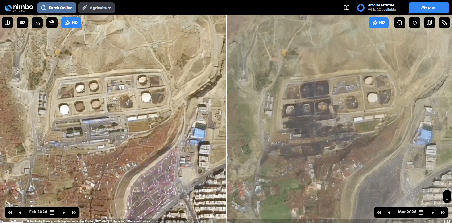
The three visuals tell a more precise story. The Google Maps image showed genuine alteration, but it provided no clear chronology. Nimbo separates the site’s evolution into at least two visible change windows: a first major alteration between May and June 2025, followed by further change between February and March 2026.
Nimbo is not designed to pinpoint the exact acquisition day of every pixel, identify the weapons used, or deliver object-level damage assessments. What Nimbo establishes here is a sequence of visible states: substantial alteration was already present by June 2025, and further change appeared between February and March 2026. That sequence is enough to show that the change visible on Google Maps in March 2026 cannot be attributed to that single event.
This is a common OSINT failure mode. The analyst observes a genuine feature but assigns all of it to the most recently reported event because the basemap lacks an obvious and comparable timeline. A dated monthly archive does more than disprove the wrong interpretation: it separates successive episodes of change and directs the analyst toward the source acquisitions and external reports that need verification.
It also illustrates the broader need Nimbo addresses. A general-purpose basemap is often sufficient until the user needs to make an operational decision from the imagery. At that point, the requirement is no longer simply a sharper or more recent-looking picture. The user needs a predictable observation period, a comparable monthly history, consistent processing across the entire area of interest and imagery that can be used directly in operational tools.
The transition from “show me this place” to “show me what changed and when” is the moment when Nimbo becomes relevant.
How we checked the claim
The verification process was deliberately simple. We first located the reported site and fixed the map extent so that differences in framing would not be mistaken for changes on the ground. We then compared May with June 2025 to identify the first major visible alteration, and February with March 2026 to test whether a further change appeared around the time of the later reported attack.
The two comparisons constrain separate change windows. They do not provide an exact event timestamp because each Nimbo layer represents a monthly mosaic rather than a single instantaneous acquisition. Original Sentinel-2 observations, native very-high-resolution imagery and independent reporting are still required to refine the dates and attribute the cause.
This separation between observation, dating and attribution is essential. The imagery shows that the site changed. The monthly archive constrains when distinct changes became visible. Neither step automatically explains why the changes occurred or who caused them.
Why the “before” image is often more useful than the “after” image
An image acquired after an event shows the current condition of a site, but it does not necessarily reveal which features are new. Without a baseline, an analyst may interpret an old ruin, a long-standing excavation or an earlier stage of construction as a recent development.
For an industrial facility such as Shahran, the pre-event mosaic records the overall configuration of the site: the arrangement of storage areas, buildings, access routes, perimeter infrastructure and surrounding urban fabric. These stable reference points make it easier to distinguish structural change from differences in colour, atmospheric conditions, processing or image quality.
A monthly archive adds another layer of context. A simple before-and-after pair shows that a transformation occurred. The intermediate months can reveal whether it appeared suddenly, developed gradually, was temporary or was followed by reconstruction. A monthly mosaic can’t pin down a precise event time. What it can do is narrow a broad question like “when did this happen?” down to a period small enough to investigate with source imagery.
Nimbo is therefore most useful in the screening and contextualisation stages of an OSINT workflow. It is not a real-time tasking service and should not replace rapid-revisit commercial imagery during the first hours of a crisis.
Beyond OSINT: the corporate blind spot
The event is unusual, but the user behaviour is not. Every day, people open Google Maps satellite view to inspect a construction site, industrial facility, farm, forest, quarry, infrastructure project or property. The image is familiar, easy to access and often sufficient for orientation.
The limitation only becomes visible when the user asks a temporal question. Is the image recent enough for the decision being made? Was this structure already present last month? Did the site change before or after a reported event? Is the same observation period available across the whole territory?
At that point, the user no longer needs only a map. They need a dated and repeatable observation layer.
This is the gap Nimbo is designed to fill. Its monthly mosaics make it possible to return to the same location using a consistent product and compare successive periods without first searching, downloading and processing individual satellite scenes. What matters isn’t just that another satellite image exists, but that this one belongs to an explicit monthly sequence.
The strongest signal that Google Maps is no longer sufficient is therefore not dissatisfaction with image sharpness. It is the moment when the date, the history or the consistency of the imagery starts affecting an operational conclusion.
Test the same question on your own location
Start with the location you currently inspect in Google Maps, then use the monthly archive to test whether the image you rely on tells the full story.
- Establish a baseline. Open a month from before the suspected change and record the visible state of the site.
- Compare the relevant period. Select the month before and the month after the event, project milestone or reporting date.
- Follow the sequence. Move through the intervening and subsequent mosaics to distinguish one change from several successive changes.
- Verify before attributing. Use original acquisitions, higher-resolution imagery or independent sources when the conclusion depends on an exact day, small object or responsible actor.
This first comparison is intentionally simple. A user should be able to determine within a few minutes whether the dated monthly history adds information that the familiar basemap did not provide.
From a one-off check to an operational monitoring workflow
A free comparison is enough to validate the basic need. The commercial value appears when the same question must be answered repeatedly: across many sites, over a large territory, every month, by several users or inside an existing GIS or application.
Assembling source scenes manually becomes a recurring production task. Teams must identify usable acquisitions, manage clouds, harmonise neighbouring scenes, publish the imagery and repeat the process for every new period. Nimbo removes much of that preparation by delivering a homogeneous monthly product that is already available in Earth Online and through standard map services.
This changes the economics of satellite monitoring: the organisation isn’t just paying to view an image, but to avoid repeated preprocessing, keep a comparable historical record, and make the imagery directly usable by its own people and systems.
Finding the right setup comes down to how your team actually works:
- The Discovery Plan: Best for occasional fact-checking. It’s the easiest way to test if a monthly imagery baseline actually improves your analysis on a specific site.
- Paid Plans: Built for recurring operations. When checking historical satellite data becomes a regular part of your weekly workflow across multiple locations, this covers the volume.
- Enterprise Configurations: For large-scale integration. Designed for larger volumes, multiple users, GIS and application integration, and requirements such as pixel-level temporal traceability.
Nimbo HD can also improve visual readability when the workflow benefits from a 2.5-metre reconstructed layer. It should be treated as an interpretation aid rather than a native very-high-resolution acquisition, with fine-scale conclusions verified against the appropriate source imagery. Learn more about Nimbo HD Basemaps
Are you using Google Maps satellite view for an operational question?
If you currently use Google Maps to check sites, infrastructure, projects, territories or recent events, open the same location in Nimbo and move through the dated monthly archive. The objective is not to prove that Google Maps is a poor product. It answers a different question.
Google Maps helps you understand where something is. Nimbo is designed to help you investigate what changed, when it changed and whether the displayed imagery is temporally consistent.
Ready to upgrade your monitoring workflow?
Whether you need to run a quick baseline check on a single site or integrate automated monthly imagery into your organisation’s GIS, Nimbo scales to fit your operation.
Discuss your monitoring workflow with our team
Images contain modified Copernicus Sentinel data, processed by Nimbo.